Posted on — Leave a comment

Confessions of a French Stenographer (A Tracing of a Frazetta Painting) | Jim Camp | synaesthesia press

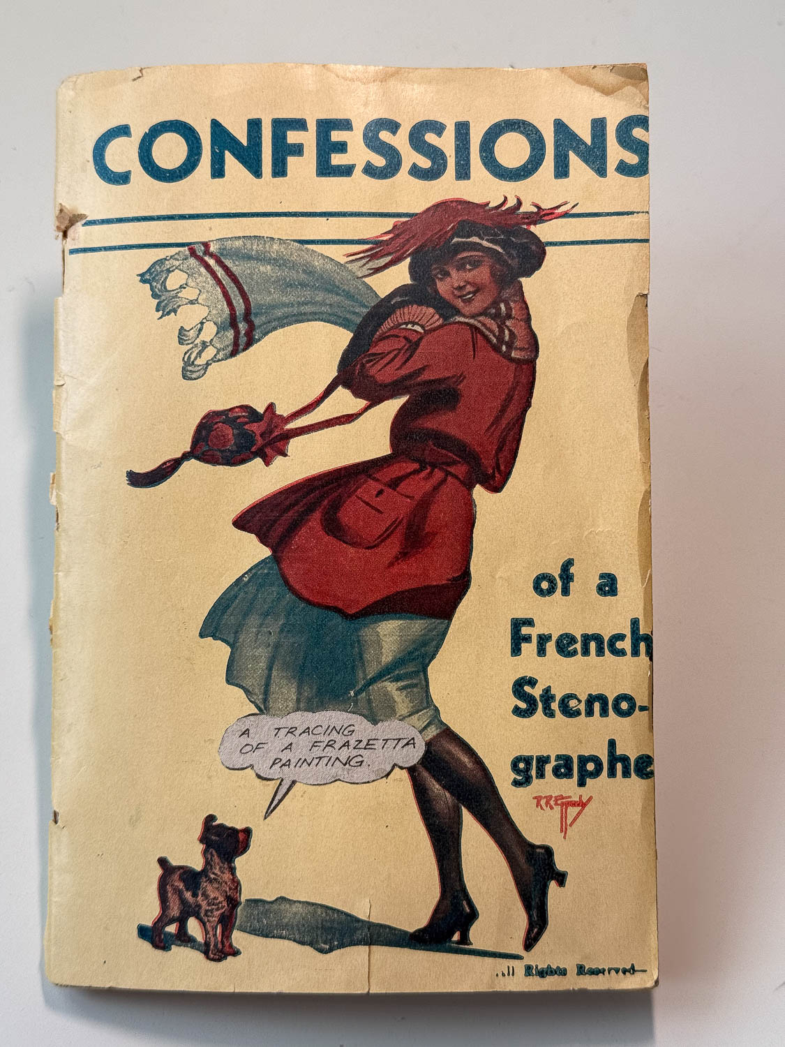
Various pictures of the Jim Camp artists book Confessions of a French Stenographer

Confessions of a French Stenographer (A Tracing of a Frazetta Painting)

Published Winter 2015 by the synaesthesia press

One-of-a-kind artist’s book. 32 unnumbered pages. 5¼ × 7¾ inches (13.34 × 19.69 cm). Stapled wraps.

Letterpress over collage throughout, incorporating hand-assembled vintage printed material, found paper, cut-outs, and laid-in ephemera unique to each page. Printed and assembled by Jim Camp. Colophon letterpress printed on the inside rear cover reading: “Confessions of a French Stenographer (A Tracing of a Frazetta Painting) assembled by Jim Camp at the synaesthesia press, Los Angeles. Winter 2015.” Signature stamp by the publisher beneath the colophon.

The cover consists of a vintage romance magazine illustration, extensively altered through collage and overprinting, with the subtitle presented in a comic-style speech balloon. As with the interior, no two pages follow a conventional sequence of illustration or text, each spread functioning instead as an individual collage composition. Conceived as a unique artist’s book, Confessions of a French Stenographer (A Tracing of a Frazetta Painting) was not offered in an edition and remains the sole copy produced.

Availability: Out of print

Posted on — Leave a comment

June 1, 2014 | Tosh Berman | synaesthesia press

June 1, 2014

Tosh Berman

Published March 2015 by the synaesthesia press.

Chapbook. Letterpress printed by hand on a Vandercook OS 219 using a combination of hand-set type and polymer plates. Hand-sewn into wrappers. Signed by the author. Tipped-in color illustrations. Issued in four variant cover colors with no particular priority: Steel Blue, Factory Green, Safety Orange, and Kraft Speckletone.

Edition of 300 copies.

June 1, 2014 is a memoir piece by Tosh Berman recalling a remarkable moment in his family’s history. In the spring of 1967, Tosh’s father, the artist Wallace Berman, received a letter from London containing a photograph and a request from Brian Epstein, manager of The Beatles, seeking permission to reproduce Wallace Berman’s image on the cover of Sgt. Pepper’s Lonely Hearts Club Band.

Tosh recounts his first impression of the now-iconic album cover and reflects on the strange intersection of family history, art, and popular culture. The piece later appeared in expanded form in Tosh: Growing Up in Wallace Berman’s World (City Lights Books, 2019).

Originally published on Tosh Berman’s Facebook page as part of the “2014 Series,” a year-long project in which he posted a short vignette every day throughout 2014.

Design, printing, and binding by Jim Camp.

Availability: Available from the synaesthesia press.

Posted on — Leave a comment

Music Box | Jim Camp | synaesthesia press

Music Box

Photography by Jim Camp.

Published 2012 by the synaesthesia press.

Approximately 6¼ inches square. Thirty original giclée photographic prints laid into a found cardboard box. Accompanied by a letterpress-printed wraparound band, printed cover, translucent frontispiece bearing a quotation by Jack Gilbert, and a repurposed vintage library card pocket used as a tabbed folder containing the colophon.

Edition of 26 lettered copies.

Music Box grew out of a trip to Memphis, Tennessee, for Gonerfest 9, the annual music festival hosted by Goner Records. Using a Canon PowerShot S95, Jim Camp photographed performers, audiences, and moments surrounding the festival over several days in September 2012.

Rather than presenting the photographs in a conventional book format, Camp assembled them as an found box, combining original photographic prints with found materials, letterpress ephemera, and handmade elements. The result functions simultaneously as photographic portfolio, music document, archive, and object.

The thirty photographs included in the edition document a range of performers appearing at Gonerfest 9, including The Oblivians, NOBUNNY, White Mystery, Bad Sports, Bobby Hussy, and Bits of Shit, among others. Together they form a visual record of one of independent music’s most influential annual gatherings.

The wraparound band, frontispiece, and accompanying printed materials were letterpress printed at Letterpress Central with the assistance of Cindy and Gary Iverson. Cindy Iverson also assisted in the design and production of the cover materials.

Photography, design, letterpress printing and assembly by Jim Camp.

Availability: Available from the publisher.

Posted on — Leave a comment

Volta 2 | synaesthesia press

Volta 2, a 2009 synaesthesia press mixed-media portfolio containing poetry, fiction, photography, found imagery, artwork, and printed ephemera housed in an illustrated envelope.

Published 2009 by the synaesthesia press.

Portfolio. Approximately 6″ × 9″ (15.2 × 22.9 cm). Housed in a black envelope illustrated with a vintage men’s magazine advertisement printed using Print Gocco. Edited, designed, printed, and assembled by Jim Camp and Nathan Feller. Published by the synaesthesia press.

Edition of 100 copies printed at the synaesthesia press in Tempe, Arizona and Los Angeles, California.

In addition to the printed colophon, the contents include the artwork “Welcome! Well, Hello!” by Nathan Feller; the short story “Natural Sines & Cosigns, Tangents & Cotangents (A Love Story)” by Jim Pritchard; the photograph “Herbert Huncke Smoking a Sherm in the Back of a NYC Cab” by Laki Vaz; a found photograph digitally altered by Jim Camp; a found, color transparency selected by Jim Camp; and poems by Henry Tokarski (“Black Spring”), Marie Kazalia (“No Elvis Sightings”), Charles Bukowski (“Untitled”), Richard Brautigan (Widow’s Lament”), and Henry Denander (“Workth”). Most letterpress printed.

The second issue of Volta marked a transitional moment in the history of the press, produced in the middle of its move from its second Arizona period to its Los Angeles period. Conceived as a mixed-media portfolio rather than a traditional literary magazine, the publication brought together contemporary writing, found imagery, photography, visual art, and ephemera in a format heavily indebted to Wallace Berman’s Semina, as well as mail art, and other experimental assemblage publications.

Unlike the later issues of Volta, the first two function as an open container for disparate voices and forms, emphasizing juxtaposition, surprise, and the relationship between text and image.

“Art is Love is God.”

Availability: Out of print.

Posted on — Leave a comment

Charles Bukowski’s Lost Essay in 4 Poets | A Notebook Discovery

One of the more unusual things the synaesthesia press ever published was an essay by Charles Bukowski on the state of American poetry.

The piece appeared in 4 Poets, synaesthesia press chapbook #2, and has long since gone out of print.

Bukowski wrote the essay in 1964. I discovered it while working in the Special Collections Department at the University of Arizona. The manuscript was preserved in one of those inexpensive spiral-bound notebooks. It cost all of thirty-nine cents and looked like it had lived a hard life. There were beer stains, doodles, random observations, abandoned ideas, personal notes, and the sort of material most writers never expect anyone else to read. To hold it in my hands was a thrill. For a young publisher and devoted Bukowski reader, it felt like I was given a backstage pass.

Then, right in the middle of it all, was this wonderful essay.

The notebook turned out to be a treasure trove. It also contained the handwritten first draft of The Day It Snowed in L.A., which would not appear in print until more than twenty years later and survived almost unchanged from the version preserved in the notebook. The cover illustration I eventually used for 4 Poets was found there as well. Another essay, “The House of Horrors,” also emerged from those same pages and was included in a small number of special copies.

I can’t adequately describe what it felt like to hold that notebook in my hands. At the time, it was one of the great thrills of my young publishing life. Looking back, I realize it was one of those experiences that can only happen once. For a few hours, I wasn’t reading Bukowski anymore. I was sitting beside him while he worked.

4 Poets was published in an edition of 243 copies, along with 11 special copies containing the additional Bukowski essay “The House of Horrors.” Those special copies were issued in 11 different variant covers, each representing a cover design I had considered for the regular edition. Both editions sold quickly. Every so often a copy surfaces on the secondary market, usually to my surprise. I haven’t had one to sell in years.

What remains is the memory of that notebook and the privilege of bringing a small piece of it into print.

Posted on — Leave a comment

Billy Childish Woodcuts for Barry Gifford’s The Strangest One of All

Johnny Brewton introduced me to Billy Childish.

If you already know Billy’s work, an introduction is unnecessary. If you don’t, Billy Childish is one of the most fiercely independent artists of the last fifty years—a poet, painter, musician, novelist, woodcut artist, and cultural force whose influence far exceeds his mainstream recognition. Working largely outside traditional institutions, Childish has built an international following through a relentless commitment to making art on his own terms.

And it was through Johnny’s introduction that I had the opportunity to work with Billy on one of my favorite publications: Barry Gifford’s The Strangest One of All, a meditation on Barry’s trip to “The Bunker”.

For the project, Billy created a series of original woodcuts depicting Burroughs. The standard edition features a single Childish woodcut visible through the die-cut window on the cover. The lettered edition of 26 copies includes two additional original woodcuts, housed separately in a manila envelope. Together they form a remarkable visual counterpart to Gifford’s text.

What I particularly love about Billy’s contribution is its directness. Every image focuses on the same subject: William S. Burroughs. Childish strips away mythology and celebrity, returning again and again to the face of the writer himself. The result feels both reverential and unsentimental.

Billy affectionately referred to Burroughs as “the old duffer,” a phrase that still makes me smile. It captures something of Childish’s relationship to literary and artistic heroes. Admiration, certainly—but never worship.

Working with Johnny Brewton, Billy Childish, and Barry Gifford on this project remains one of the highlights of my synaesthesia life.

Posted on — Leave a comment

Richard Brautigan chapbook Four Poems

4poems.jpg

I was talking to my friend Mark at his bookstore in the Haight, St. Adrian. This was a long time ago.

We talked about books.

We talked about Kerouac or Bukowski or maybe the great things coming from X-Ray Press. I don’t recall.

Then, we talked about Richard Brautigan. I do recall this, because as we were talking, Mark brought out a copy of All Watched Over By Machines of Loving Grace. It was a first (and only) edition, and it was published by the Communications Company in 1967 — and probably within walking distance of Mark’s store.

We talked about the fact it was probably printed right around the corner, and we talked about the fact that, 30 years earlier, Brautigan had roamed this very neighborhood, handing out poems and chapbooks freely, and how that sort of thing doesn’t happen much anymore.

We even talked about R. Crumb walking this same neighborhood during the same time, pushing a baby carriage full of Zap #1, and how he sold them right out of the carriage.

Then Mark read the copyright from Brautigan’s book: “Permission is granted to reprint any of these poems in magazines, books and newspapers, if they are given away free.” The book was published in an edition of 1500 copies — none of the copies were offered for sale — they were all given away.

The entire edition was given away. 1500 copies. Free.

We both agreed this definitely doesn’t happen anymore.

I bought some books from Mark, jumped on the #7, and headed back down to the Tenderloin and the hotel I called home.

Sadly, St. Adrian’s doesn’t exist anymore, either…just like Crumb and his baby carriage and people giving stuff away for nothing.

A few years later, while working on the Vandercook, I decided to take a few of my favorite poems from All Watched Over By Machines of Loving Grace, print them, and, following his copyright, give the book away to the friends of the synaesthesia press; the people who, since its inception, have supported synaesthesia either through shared knowledge, submitting work, or buying the books.

4 Poems was the result.

Twenty-six lettered copies were printed. There were maybe 20 “overs” which were sent to Brautigan’s daughter, Ianthe.

I have no more.

My only hope here is it’s an adequate thanks for all those who have helped synaesthesia make it this far.

And maybe this little book has some of the spirit and essence that All Watched Over By Machines of Loving Grace offered.

Posted on — Leave a comment

Neeli Cherkovski’s Wedding Poem for Johnny Brewton and Giselle Orsolio

When Johnny Brewton married Giselle Orsolio in 1998, I got an idea.

I thought it would be nice to mark the occasion with something “lasting” (for lack of a better term), so I approached poet Neeli Cherkovski and asked if he might write a poem for them. I had met Neeli several times at his home in San Francisco and always found him to be gracious, generous, and encouraging. That made it easy to pick up the phone and ask.

His response was immediate.

Not only was Neeli willing to do it, he was genuinely excited by the idea. A few days later he called and told me the poem was finished.

I printed about one hundred copies and distributed them to guests at the wedding reception. Reading Neeli’s poem again, what strikes me is how well it captures the optimism and mystery of marriage. Rather than offering advice or sentimentality, Neeli writes about union, imagination, reflection, and the ways two people discover both shared and private worlds together.

More than twenty-five years later, I’m still grateful Neeli said yes.

Johnny Marries Giselle

I

it’s a wonder
like grass, the glass
in that music, brittle
steel, strong
silence pushing a man
through print
into light, the marriage
of spirit and
soul, the union
of imagination and
mind, the rooms
two will find
together and those
that remain
locked in one set of eye

II

“…the marriage
of true minds…” how
we read ourselves and bend fog
backward and dream
waves, arm in
hand, lip to lip, hand in
the sky, till we bend
to our twin reflections and
never do anything but live

Neeli Cherkovski
2 May 1998

Posted on — Leave a comment

A. di Michele’s The Mollifier | Joycean HyperText from the synaesthesia press

A. di Michele’s The Mollifier was published by the synaesthesia press in November 1996.

When people ask me to describe it, I usually tell them it’s “Joycean HyperText.” That’s not my phrase—it’s how Andy described his own work, and who am I to argue with the author?

Usually that earns me a puzzled look.

“What does that mean?”

Exactly.

Go read it.

Part fiction, part linguistic experiment, part philosophical prank, The Mollifier occupies that fascinating territory where language itself becomes the subject. Like much of di Michele’s work, it refuses easy classification. The influence of Joyce is certainly there, but so are traces of critical theory, poetry, situationist thought, and a distinctly Southern strain of literary mischief. The result is a text that feels simultaneously playful and challenging, as if the language is constantly rearranging itself beneath your feet.

Di Michele also provided the illustrations for the chapbook, giving the project a visual coherence that perfectly complements the text. At the time, he was part of a loose network of poets, small-press publishers, and literary experimenters whose work circulated through little magazines, handmade books, and alternative publishing venues far removed from the literary mainstream.

One biographical note I found years ago described him as a “lingual neuro-situationist trans-bard and furniture/environment deconstructor.” That may be the most accurate literary biography I’ve ever encountered.

My favorite di Michele line remains:

“poets would do better to work in sweatshops rather than sweat in workshops.”

That should tell you everything you need to know.

Posted on — Leave a comment

Lawrence Ferlinghetti and 4 Poets | How ‘Poet as Fisherman’ Joined the Project

Front and back covers of synaesthesia press chapbook 4 Poets featuring a whimsical line drawing adapted from a Charles Bukowski notebook discovered in the University of Arizona Special Collections collection.

I met Lawrence Ferlinghetti at a reading at the Caravan of Dreams in Fort Worth, Texas, sometime around 1992. I was living in Dallas at the time, hustling as a penny-stock broker. Poetry and penny stocks made for an odd combination, but there I was. Looking back, my life has always seemed to work that way.

After his reading, Ferlinghetti stayed to sign books and answer questions. When my turn came, I asked if he might have a poem available for a small publishing project Steve Fisher and I were assembling. Without hesitation, he opened the folder he was carrying, pulled out a poem, and handed it to me.

Just like that.

No introduction required. No gatekeeper. No elaborate proposal. No discussion of contracts or credentials.

What I remember most is not the poem itself, but the generosity of the gesture.

Pure class.

The poem was “Poet as Fisherman,” and it would become the final contribution to what was then an untitled project. With Ferlinghetti’s participation, the book finally felt complete. The collection was eventually published as 4 Poets, bringing together four distinct voices in a modest edition that remains one of my favorite early publishing efforts.

Years later, Ferlinghetti included “Poet as Fisherman” in These Are My Rivers: New & Selected Poems 1955–1993, published by New Directions. I’m glad he did. But I’ll always remember the moment before that, when the poem existed simply as a few sheets of paper in a folder carried by one of America’s greatest poets.

4 Poets was published in an edition of 232 copies, along with 11 special copies featuring variant covers. Those special copies were never intended as a deluxe issue. They were simply experiments—different papers I was considering for the cover stock. Like many things in small-press publishing, they survived because I couldn’t bring myself to throw them away.

Looking back, what stays with me most is Ferlinghetti’s kindness. A young publisher asks for a poem, and one of the giants of American poetry simply says yes.