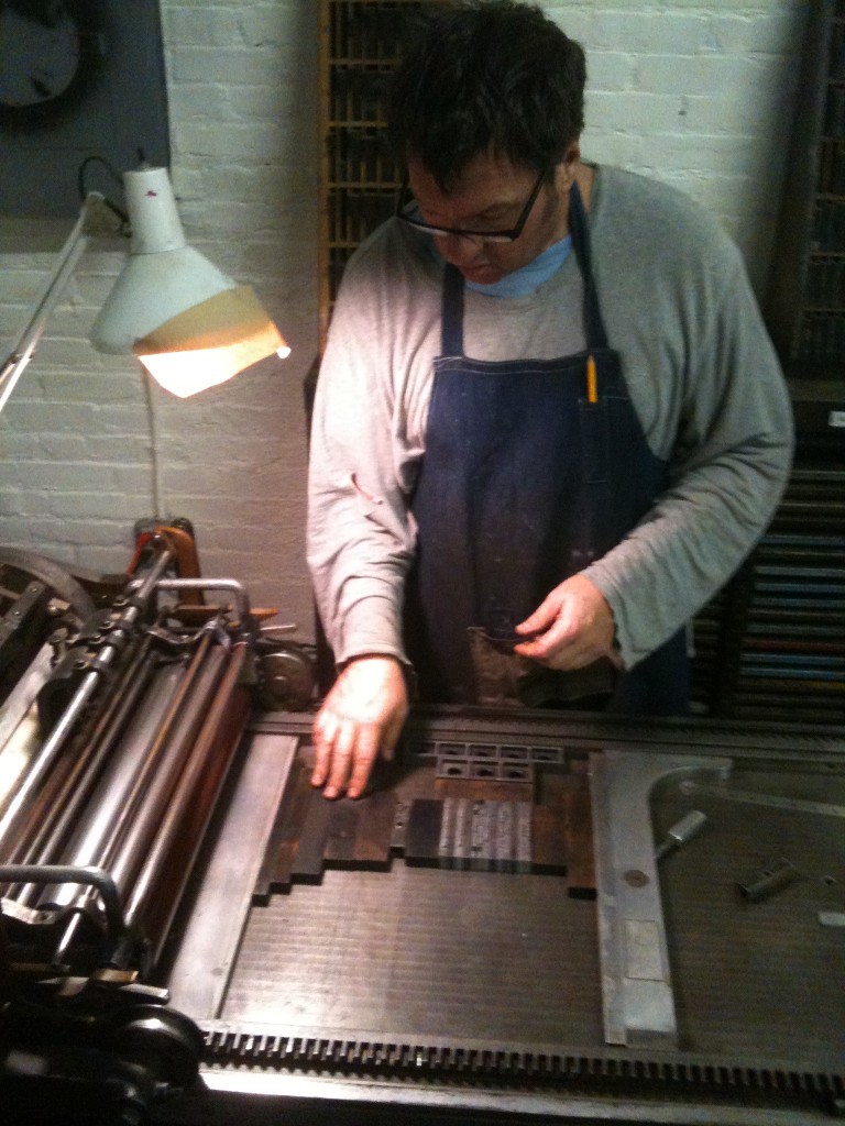
“[Robert] McAlmon’s friend [McAlmon’s publishing house was Contact Editions] was fellow-publisher William Bird. Bill Bird was a prominent member of the press in Paris, who spent his spare money and time on the little, entirely personal, editions of the Three Mountains Press. He had heard from a fellow-writer of a bargain hand press that was available, and installed it in a tiny office on the île Saint Louis. He was engaged in printing a book when I went to see him one day. He had come out onto the sidewalk to see me because, as he explained, in his “office” there was room only for the hand press and the printer-editor. Bill Bird knew all about rare editions. He was a bibliophile, and his publications were everything a collector could wish–they were printed in handsome type on large pages of fine paper, and the editions were limited. Bird brought out Pound’s Cantos and Indiscretions, Ernest Hemingway’s In Our Time, and F.M. Ford’s Women and Men, among others. Bill was a great connoisseur of wines, too; the only one of his publications that was not on large paper was a booklet called French Wines. The author was William Bird.” — from Shakespeare and Company by Sylvia Beach.
Oh, how I can identify with old Bill Bird! I think we could have been pals. I learned about Bill today at — of all places, Twitter. I refuse to call it X. It’s one of the things I love about that platform: watch a ridiculous video of Trump’s incoherent ramblings in the same place I can learn a little bit about old Bill Bird and his Three Mountains Press.
This was a big deal for me. I started buying records in the spring of 1975, when I was in 5th grade. Maybe the fall of ’74. I don’t remember exactly.
I do remember the very first record I bought with my own money — Jim Croce’s Greatest Hits. I don’t remember the records that came next. I do remember, in the 7th grade, asking my mom for permission to buy KissAlive! from Smitty’s Big Town on Shea and Tatum.
“No. No Kiss. You won’t like acid rock,” she said. So, instead of Kiss, I bought Jeff Beck’s Wired and hated it so much I stuck it into the toaster after a listen. The next time my parents took me to Smitty’s, I headed back to the record department.
“I’d like to return this.”
“What for,” the dude running the record department said.
I handed him the record. “Look, it’s warped.”
He inspected it carefully, then inspected me, then inspected the record again; then he said, “this looks like you did it.”
I swore that’s the way I got it, and he relented, adding, “Store credit only. No cash back!”
I wish I could tell you I walked out of there with Kiss Alive!, but it was a double record, which meant it was a couple bucks more — and I didn’t have any money. And I wish I could tell you I grabbed something really cool, but that would be a lie, too.
Billy Joel. The Stranger. Why’s he sitting on the bed, staring at the mask on the pillow, barefoot in a suit? What’s up with the boxing gloves hanging on the wall?
A few years later, in the fall of 1980, a kid I played football with called Pat Crane lent me London Calling!, Singles Going Steady, and an 10″ EP (on green vinyl!) called Klark Kent. Pat’s records changed the way I listened to music. Before that, it was metal bands and whatever was on heavy rotation on KDKB. I’d buy records with the money I made working for my dad. He built houses then. I’d ask for records as gifts, too.
In the late-80’s, everyone started selling their records (or giving them away!) and replacing them with CD’s. By this time, I was friends with Ben Wood and Mike Pawlicki and Clayton Agent. They worked at Zia. I sold some of my records to Ben and Clayton when left Zia to open their own store in ’87. (I just wanted to help out Ben a little starting out — although he didn’t take many of mine.) Mike joined the crew almost immediately, and Eastside Records became my go-to. By 2000, records were really cheap and I was buying a lot. But that didn’t last too much longer.
I moved to Los Angeles in 2009. I kept buying, even though records weren’t cheap anymore. Then, seemingly overnight, they got expensive. Really expensive. There were a few more years where you could still score some at a flea market, but those days are pretty much gone, too.
My mom had a stroke. Elder care begins now. There’s no room at her place for 30 boxes of records; and honestly, I’ve been over them for a while. I think what I’m gonna miss most is The Ritual: picking out the LP from my wall of records; sliding it out of its sleeve; placing it on the turntable; gently pulling the trigger on the anti-static gun and then immediately running the brush along the grooves to pull off any dust; then finally listening while I read the linear notes off the back; or, even better, opening the gatefold to check out whatever was going on in there. And the warmth analogue brings to a room!
When I sold the collection, I kinda choked up. Not because I don’t have anymore records. They’re just things. It’s more about the chapters life brings us; ending old ones and starting something new.
But wait! I just found a box of my books at mom’s from last year’s VNSA Sale. Oh, I forgot about these!! And at the bottom of the box? Five records! And would you look at them?! Nothing like it.
What if I kept 10 records at a time? No more. Just less. And once I get to 10, in order to buy a new record or two, I’d have to bring a record or two in to trade? With the five I have, I got room for five more! And what if I wrote about what I get — and what I take back? Not to critique the record but more to tell a story? Records have stories. Just like books do. So why give up a beat-up (but numbered!) White Album or a funky Dave Brubeck EP in order to get, say, something by Big Star or Led Zeppelin IIIor Ascension or a spoken word Bukowski title?! And now that I have it, why would I ever give up that Leadbelly EP?
The possibilities are endless.
take this hammer: Leadbelly Legacy Number One. Folkways Records FA 2004. Introduction and notes on the recordings by Alan Lomax. 1950.
The Beatles. Apple SWBO-101. Lacking all the cool ephemera. #2592565. (Note the “o” is elevated (superscripted). This is the same fashion as records from England are numbered. This variation is commonly found on covers numbering from about 2,250,000 to about 2,600,000 and with records pressed in Jacksonville FL. 1968.
Dave Brubeck Quartet. Fantasy Long-Playing Microgroove 3 – 5. 1952.
Rubber Soul. Capitol ST 2442. 1965.
Let It Be. Apple 34001. 1970. First Scranton US pressing. Identifier: “Maggie Mae” credited to “P.D.”..
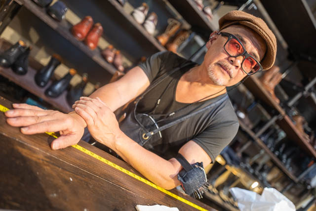
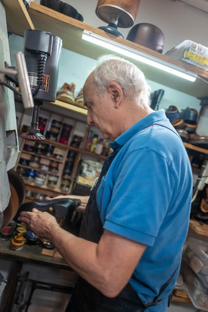
I’ve got an obsession with Everything Old. And All Things Made By Hand. And an appreciation for others who have my weird hang-up. Whether it’s amateur snap shots, or obsolete machinery, or a cobbler’s tiny workspace, I’m all about it.
So I was wandering around San Francisco on a recent venture and stumbled into Al’s Attire. It’s kitty-corner from Cafe Trieste, one of my SF go-to’s. Which is right down the street from City Lights and The Condor (which is where Carol Doda worked), and a biker bar (its name I can never remember).
(If you’ve got a minute, follow the Carol Doda link and check out every single one of the 51-pic set the SF Gate published for her obit.)
Al’s is amazing. Al is amazing! I try to carry my camera around all the time, and Al was nice enough to let me make a picture or two. His shoemaker (another name I can’t remember grrr.) let me make one, too. Pick some cloth off the sample, get measured, and let Al go to work. Same with the shoes; pick soles, material, style, and don’t forget the custom “Al’s Attire Custom” label with your name.
I need a wardrobe re-do.
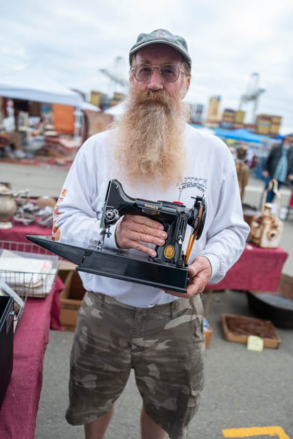
The Alameda flea market is another go-to. It’s one of the greats. It’s a first-Sunday flea, and I’ve never been disappointed. I made a portrait of Dave there. He cleans up old sewing machines, gets them working again, then sets up shop at Alameda. His booth was right next to a Snap Shot Guy who had a picture of a woman reading Tarot in a field in 1917. Under the picture someone wrote “Gypsy telling the future” with impeccable penmanship, beautiful cursive.
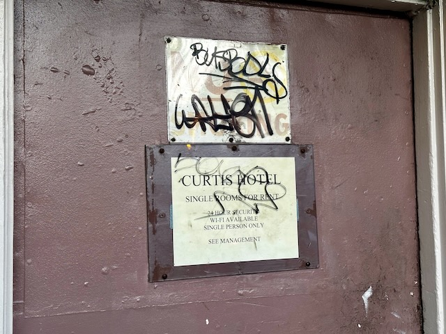
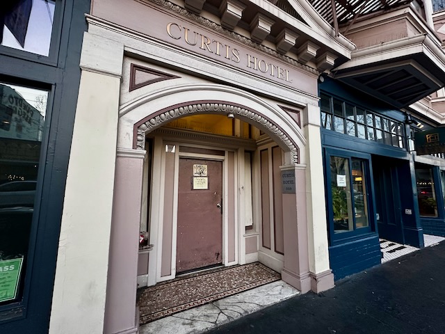
The last time I walked into the Curtis Hotel, it was for an appointment with Jack Micheline. I wanted to buy some paintings.
It was 1996, and I had just landed in SF for grad school. One of my first days there was spent exploring the city I’d spend the next three years calling home. So I jumped the BART and headed to 16th Street.
The Mission. It was kinda gritty and kinda grimy. My kinda place. And I had heard about The Abandoned Planet Bookstore, which was my final destination that day. What a great place. One of my all-time favorite bookstores, ever.
Along the top perimeter of the store, completely out of reach and above the top row of books were maybe a dozen or so paintings. Totally Outsider work. I don’t know why I ID’d the artist so quickly; it’s not like I had seen any of Jack’s works before. But one — a portrait of Jack Kerouac as a football player at Columbia, caught my eye. I asked the clerk, “hey, did Jack Micheline paint that?” The bookseller confirmed, then without quoting me a price, got on the phone.
“Hey, there’s someone here who wants to buy a painting.”
And within 3 minutes — literally — Jack lumbered into the store and walked right up to me. “Which one you want?!”
I pointed to the Kerouac. Jack offered it up at a bargain. I ended up commissioning another author’s portrait — one of Henry Miller — and I bought three other small paintings. Jack invited me over to his room at The Curtis to pick them up. Then I had a new friend.
Jack and I worked on a chapbook together, and once, walking through the Missions, Jack told me, “you need to meet Johnny Brewton. You need to see his work!” Jack and I ate at Kenny’s from time to time; once, he asked me to be a thug and sent me over to this dude’s house who owed him money (I had a hard time not laughing as I asked the dude for Jack’s dough, tough guy that I am); and Jack even made a cover for a book catalogue for me (when I used to send those out).
But my best memory with Jack was when he walked me over to his painted room over at Scott Harrison’s bookstore and taught me the “proper way” to read poetry to a crowd.
They’ve cleaned The Curtis up since 1996…at least the outside of the place. The whole Mission is gentrified. The Abandoned Planet went the same way most of the other brick-and-mortar bookstores. And Jack died in 1998 on a BART train bound for Orinda.
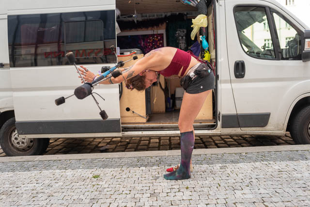
Wendy Blades is, among other things, a sword swallower / human sword basket, an emcee, and a chairstacker; she can escape from straight jackets and eat fire; and, finally, she’s a human cutting board.
I don’t go anywhere near Pier 39 or Fisherman’s Wharf while I’m in the Bay Area. But I was with family and while we were “doing touristy things”, I was lucky enough to catch her between sets. So I made this portrait of Wendy and her doggo.
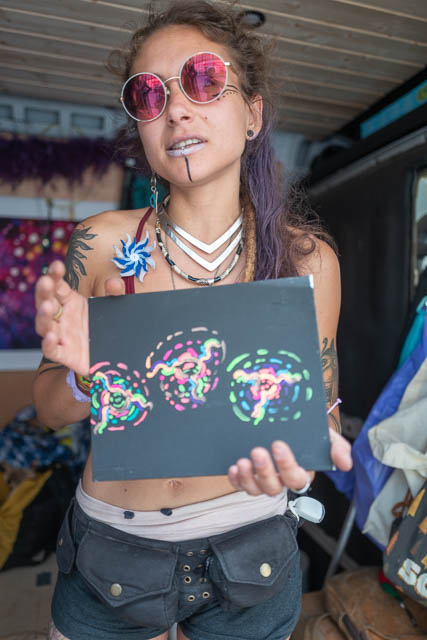
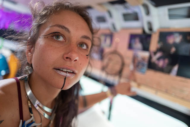
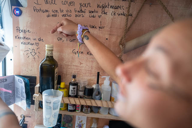
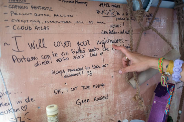
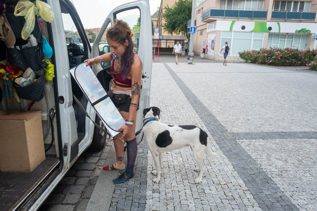
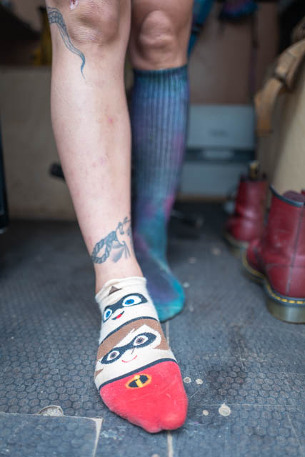
I was walking back from the coffee house when I met Marianna, her dog Duna, and Amber The Pink Puppy.
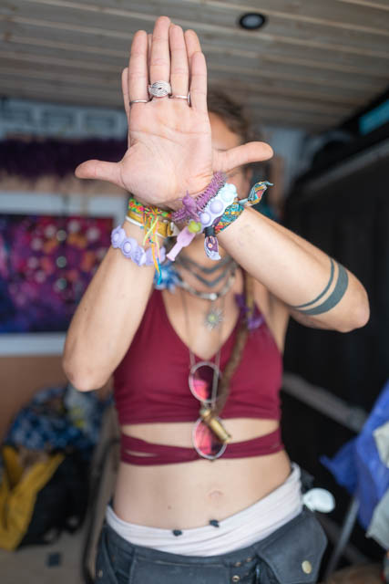
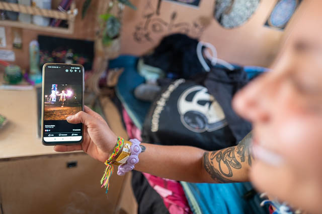
Marianna wears friendship socks and makes paintings of her her Changa Trips. Changa — a mixture of DMT and edible flowers and plants. She smoked a changa joint and began to see colors and shapes and when she squeezed her eyes shut and moved her hands in front of her eyes, well…Marianna painted what she saw.

 “[Robert] McAlmon’s friend [McAlmon’s publishing house was Contact Editions] was fellow-publisher William Bird. Bill Bird was a prominent member of the press in Paris, who spent his spare money and time on the little, entirely personal, editions of the Three Mountains Press. He had heard from a fellow-writer of a bargain hand press that was available, and installed it in a tiny office on the île Saint Louis. He was engaged in printing a book when I went to see him one day. He had come out onto the sidewalk to see me because, as he explained, in his “office” there was room only for the hand press and the printer-editor. Bill Bird knew all about rare editions. He was a bibliophile, and his publications were everything a collector could wish–they were printed in handsome type on large pages of fine paper, and the editions were limited. Bird brought out Pound’s Cantos and Indiscretions, Ernest Hemingway’s In Our Time, and F.M. Ford’s Women and Men, among others. Bill was a great connoisseur of wines, too; the only one of his publications that was not on large paper was a booklet called French Wines. The author was William Bird.” — from Shakespeare and Company by Sylvia Beach.


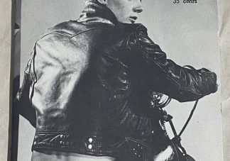
 Sid Vicious would’ve been 65 today. Try and wrap that around your head.